TIMELINE
Q2 2024
PLATFORM
WEB APP
MY ROLE
UX/UI DESIGN
+52%
Click & Collect orders
+65%
loyalty app signups
When ordering on a kiosk, customers expect a similar experience to that of our competitors, such as McDonald’s, KFC and Burger King (cf: Jakob’s Law).
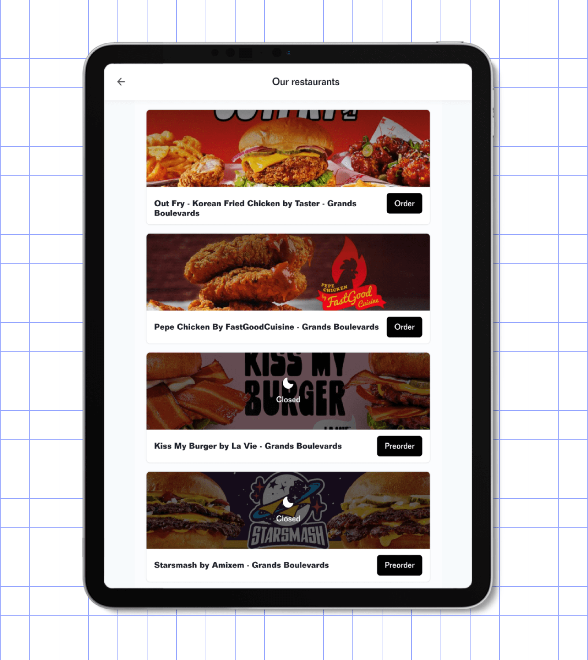
The current self-ordering kiosk UX and UI is inherited from the mobile version of the Click & Collect app, which led to many UX issues such as:
The images are small or non-existent in the case of meal deals
Customers don’t read item descriptions and the text is small
Understanding the difference between between different brands’ menus is high effort
Customers are confused because standard practices related to selecting options and upgrades aren’t followed.

The current self-ordering kiosk interface inherited from the Click & Collect mobile app
SOLUTION
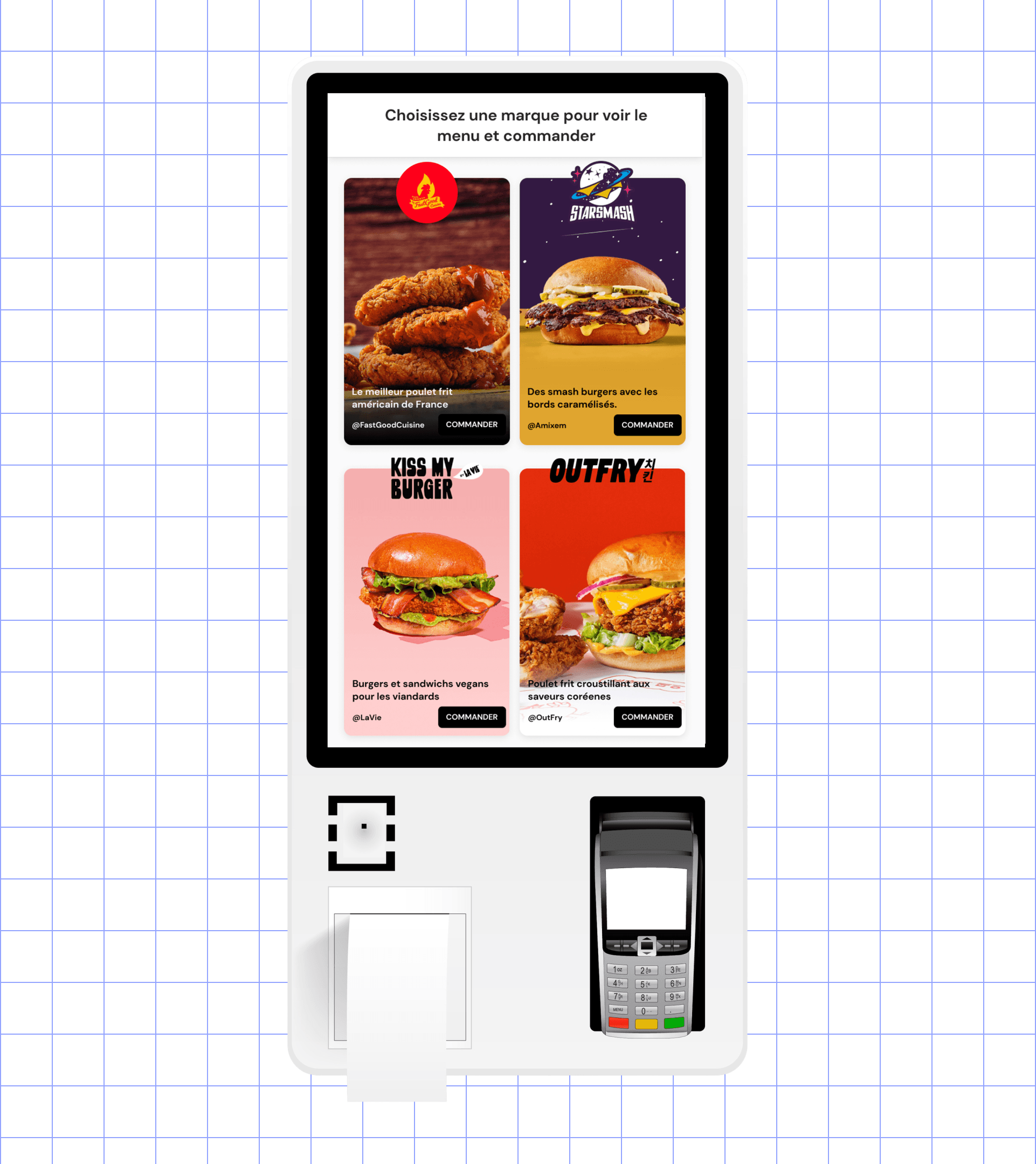
Competitive research insights
To define what the standard practices are for self-ordering kiosks, I went to global fast food chains like McDonald’s, Burger King and KFC, and smaller quick service restaurants like Street Bangkok and Mamé.


PROBLEM #1
Since most customers discover the brands via the influencers, the new brand selection page is inspired by the UI of social media platforms to emphasize familiarity…..